
Atlas F1 GP Illustrator
Painting is not only about talent, and the creation process is far more complex that it may appear. There are endless rules, and several do's and don't's that escape the eye of the casual viewer. Atlas F1's GP illustrator Bruce Thomson brings you closer to the experience of creating a piece of art
It's going to be a little intimidating to produce a painting this publicly. For one thing, every painting is an experiment to a greater or lesser extent, and experiments can of course, go badly awry. For another, paintings tend to look best when they are finished; I know that many students give up on their work too early because of the fact that paintings can look like such rubbish in their early to mid-stages. I'm used to working alone and not having my work seen until it is complete, so this article will be an eye-opener for me. I can only hope that it will be for you, too.
So, Let's start shall we?
Having assembled the photographic reference I will need to render the details of the car accurately, I begin to sketch. Initially the sketches take the form of what we call "thumbnails"; which are tiny sketches, usually no bigger than two or three inches. I'll do about five to 10 of these on a single sheet. They are exceedingly rough and simply outline the broadest concepts of the proposed painting; car placement, angle, background, etc. Taking a look through the completed thumbnails I pick the one that looks most promising and single it out. I'll now develop this thumbnail into a proper sketch.
I like to do my sketches on letter-sized paper in 6H pencil. 6H is a very hard pencil that allows more precision and accuracy at this rather small scale than a softer "B" pencil would. The drawing is, for the most part, free-hand, but I do use ellipse templates to draw the wheels. Part of the reason for this is that one of the most easily spotted flaws in a painting of a car or a motorcycle is a incorrectly drawn wheel; it really sticks out like a sore thumb. To begin with I drift in the basic geometry of the car very lightly and slowly build it up. The wheels are initially free-handed and then tightened up by applying the templates to them. When using ellipses it is important to remember to align the minor axis of the ellipse (that is, the line described by the shortest distance across the ellipse) with the axle of the car. The only time this is not true is if the wheels are turning. We won't have to deal with that eventuality in this painting.
Once I have the car broadly outlined, I begin to check it for accuracy. The reason I spend so much time on this is that this drawing will form the basis of the painting, so any mistake that I make at this stage will be carried on through the painting and will compromise the finished product. I go back and measure the different elements of the car, ensuring that the ratios match the photographic reference that I have. A good way to describe this is to take a single element of the car and use it as a yardstick. For instance, if you use the front wheel as a starting point, Fernando's car is roughly six and a quarter wheels long and nearly two wheels tall, if you include the camera. Classical artists use a similar rule when measuring the human figure; your average person is seven and a half heads tall. Michelangelo used to ensure a monolithic appearance in his work by making his subjects eight and a half heads tall... but I digress.
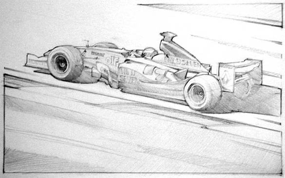
Once I'm happy with the outline of the car, I begin to work on the background. In this case, the background (and foreground) is going to be minimized to focus attention on the car. This is not to say that the background will be unimportant. The background will be every bit as crucial to the painting as the car, so I take care in getting the angles consistent, decide on how much grass to show in the foreground and at the last minute add some grass to "cap" the track at the top right hand side of the painting. I now have a good outline drawing of the painting, but it is insufficient as yet. I still need to add tone to determine the "weight" of the painting. I drift in the tone lightly, still using my 6H pencil and build it up slowly. I also begin to exaggerate the broad outlines to help "hold" the tone. This is what the finished rough sketch looks like:
I'm pretty pleased with the drawing, although there is a small problem with the front wheel that I may have to address; it could be I need to fatten up the ellipse to 60 degrees from 55. You'll notice that I've left the road largely blank. I'm thinking of doing this in the final painting too, in an attempt to give the painting a graphic look and, again, to focus attention on the car. Now I have to apply colour, so I get out a fresh sheet of paper, trace the drawing through and mount the paper on board to prevent it from buckling when wet paint is applied.
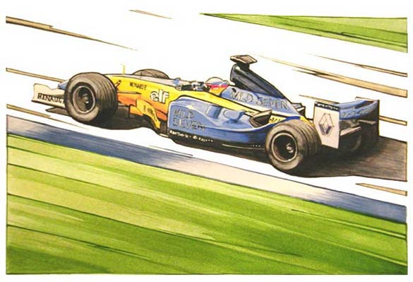
Colour is actually far more difficult than you might think, and this is why a colour rough is an important step in any painting. Many people find this hard to believe; after all, tyres are black, roads are grey and grass is green, right? Wrong. In fact, if you stick within a realistic spectrum, tyres can have components of red, blue or raw sienna, roads can have almost any colour in the spectrum added and grass can run the gamut from bronze yellow to almost blue. Take a look through any Autocourse book and you'll see that the grass in the heat of summer in Spain is a far different colour to grass at a rainy Silverstone. Having said that, we'll be sticking with a fairly obvious colour scheme for this painting. Here is what it looks like:
The colours of the car are going to be largely based on Cadmium Yellow Medium and Light Blue Violet, the grass will be composed of Hooker's Green permanent with a wash of Bronze Yellow to neutralize it and the blacks will be made up of Mars Black cut with Titanium White and Bronze Yellow to give some warmth. I may add some Twilight to the shadows to cool them down somewhat too. One of the reasons I've stuck with this fairly simple colour combination is that Blue Green and Yellow all exist on the same side of the colour wheel. What this means is that the colours are "diadic" or two colours apart on the colour wheel which will make the painting easy to look at. The only jarring colour in the scheme will be the red that is in Fernando's helmet.
You'll note that the curbing has been painted in a blue similar to the car. The reason for this is that I didn't want to stick with the more standard colour of red curbing because it would draw attention away from the car. As it is, by using blue curbing and that small stripe of Cadmium Red in his helmet, we focus attention to the centre of the car and the driver, right at the centre of the painting. The last thing you want to do is to draw attention off to the sides of the paintings by using strong colours there, as it will shift the viewer's gaze off your painting and probably onto someone else's!
Tonight I'll be taking the rough sketch and transferring it to the painting surface, or "support". At this point, I've invested a total of roughly 10 hours in the search for reference, the pencil rough and the colour rough. My goal is to have the painting finished by the first race of the season, but I'd appreciate if you don't quote me on that!
As an artist, the question I am posed most frequently has to be a variation on this: "Of all the paintings you've produced, which is your favourite?". It's a question I don't have to think about anymore, because the answer is always the same: "The next one". I'm not being glib when I say this, for me it is the literal truth. It's not that I am dismissive of my own work - far from it. The fact is however, that a completed painting offers no challenge, so while I may be fond of my work, I don't find it as stimulating as what I am working on presently or about to work on. The process of creating the painting is what is of primary interest to me. It was with this in mind that I decided to produce an article detailing the creation of a painting, from conception to finished work.
I've decided on making Fernando Alonso the subject for this painting. The first order of business is to collect as much information on Fernando's car from last year as possible. Any artist working in the genre in which I work uses photographs extensively, as it's hard to get guys like Fernando to drop by your house with his latest mount. The thing to remember is to use the photographs for reference only, and not to become enamored with any photograph so much that you are merely reproducing it. I usually collect about 15 to 20 photographic references per painting, and I have done as much for this one. My reference material comes from the internet, from magazines, from books and even from my own photographs I've taken at races.
|
Contact the Author
Contact the Editor |
Please Contact Us for permission to republish this or any other material from Atlas F1.
|
Volume 10, Issue 7
Articles
The Back End
CART and Sold
The Readers Digest
The Paint Job
2004 Countdown: Facts & Stats
Columns
The F1 Trivia Quiz
On the Road
Elsewhere in Racing
The Weekly Grapevine
> Homepage |