
Atlas F1 GP Illustrator
Painting is not only about talent, and the creation process is far more complex that it may appear. There are endless rules, and several do's and don't's that escape the eye of the casual viewer. Atlas F1's GP illustrator Bruce Thomson brings you closer to the experience of creating a piece of art
Two weeks ago, if you'll remember, I had finished the colour rough and was preparing to transfer the sketch to its full size support. The support (or surface) upon which this painting is being done is half inch MDF (a lightweight type of fibreboard) coated in gesso. Gesso is a sort of plaster that has been used for centuries to prepare canvasses for paint. It's about the consistency of a thick ketchup, but smoother. It's rather tricky to apply and get a smooth surface, and I've found that the best way to get the surface I want quickly is to thin it with water. I apply the gesso to the MDF by pouring less gesso than I think I'll need in the middle of the board, and then, using a water soaked foam brush, spread it around, mixing the water into the gesso as I spread. I spread it thinly and let it dry between coats. It generally takes about three hours to dry properly, and I like to apply about five coats, so it is a bit of a time-consuming process. The reason that I'm willing to spend the time doing this and not just use illustration board, is that I'll be painting very "wet" to get the effect I want in this piece, and illustration board tend to bend, buckle and deteriorate with excessive use of water.
When the board has received its fifth coat and dried, I take a close look at it to see if it is as smooth as I want. It is, and this saves me the trouble of having to go in and lightly sand the surface. I'm ready to begin transferring the sketch to the full size board, which is 24" x 38" (about 61 x 96.5cm). To get the drawing on the board, I use a projector, first photocopying the sketch down to about 6" (15cm) so that it will fit. My projector will take anything up to 6" square and project it anywhere from roughly 150% to 1500%. By adjusting the lens and moving the projector, I am able to make it match the size of the board. The drawing fits precisely, because I have cut the board to the same ratio as the sketch. The best way to use a projector is to have it mounted vertically, shooting downward which allows you to work on a flat surface. Unfortunately, I don't have the facilities for this, so I use it the inconvenient way; sitting on a pile of books shooting at the wall.
It's important that I take my time at this point, as the drawing must be transferred as accurately as possible to the support. It's a tricky business, as you're working in the dark, by the light of the projector, and it's difficult to see what you've drawn and what you haven't. That sounds silly, but on many occasions, I've finished the projection, turned off the projector and (critically) moved it, when I've discovered that I've missed a couple of lines that have to be drawn in. It's certainly not a mistake from which you can't recover, it's simply that it's best to get all the lines straight from the original sketch to preserve the drawings integrity.
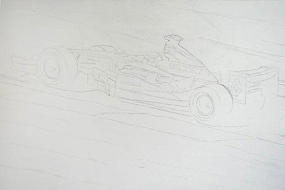
The first draft always comes out a little messy and "loose" looking. I've drawn as lightly as possible, using a 6H pencil and thus the image I've included here lacks punch.
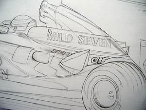
As you can see, there's a lot of work to be done. Using a 4H pencil, I go in and begin to tighten up the drawing. It's at this point that I realize my first mistake. The last time I used gesso was in the painting I did of Valentino Rossi (See "Valentino Rex"). I remember now that the pencil smudged pretty badly when I tried to erase any of it. In that particular painting, that wasn't a problem as I was working opaquely (cutting all the colours with a little white to knock out the background) so any smudging or shoddy linework was covered by the painting. In the present painting I'll be working transparently, painting very thin coats of tint on to build up transparent pure colour. Any smudging or shoddy line work will show very clearly in the finished painting. Here's what I'm talking about:
Nice. Not a problem though. If there is one thing I've learned, it's that it's not how badly you bugger something up that's important; it's how well you can fix it. After a minimum of swearing, I decide on a course of action. What I'll do is spray the finished drawing with workable fixative to lock the pencil to the board, and then apply another thin coat of gesso which will push lighten but not completely obliterate the drawing. Anywhere where I have really nasty smudges or lines I need to get rid of, I'll go in and paint over them with pure, unthinned gesso. This will add a couple of hours to the painting but it should solve the problem.
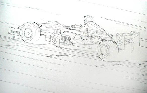
This is also the time when you begin to realize that you need more reference. I had thought I had had enough, but I can't quite figure out what two of the logos on the car are. I haven't got any good reference of the logos on the lower side pod of the car behind the Michelin logo (one directly behind the Michelin logo, the other closer to the back wheel). Again this is not a big problem, it simply means that I'll have to go back and look for specific views of the car that give me good reference of these areas. Even if I knew what the logos were, I'd probably get better reference to ensure an accurate depiction of them. I think that I said last week that if you get the wheels wrong, they stick out like a sore thumb. Well, the same is true of the lettering. A badly drawn letter or logo will draw attention to itself, so it's important to spend a lot of time and care in the drawing of all the sponsorship on the car. When doing the logos, I try as hard as possible to forget that I'm drawing letters to avoid interpretation on my part. One of my teachers used to say "Draw what you see, not what you know", which describes what I do here perfectly. Getting the logos and lettering mapped onto the curved surface of the car is the trickiest and most time-consuming business of the entire drawing.
I've almost finished the drawing, I now have to go back and figure out which logos I'm missing and also get an example of how the major sponsor is depicted on the back of the rear wing (another reference I'm short on). I'll probably get a blow of "Bibendum" (the tyre guy) to make sure that I draw him correctly. Once that's done I'll fix and re-gesso the drawing as I mentioned earlier. Here's the drawing to this point;
I've now invested roughly 16 hours on the painting and haven't even picked up a brush yet!
I didn't get as much done in this past two weeks as I would have liked as I had my kids this past weekend, which precludes the possibility of getting any work done, and I'm in the midst of finishing a very different kind of paint job; painting the interior of my house. Still, I've managed to move the painting to the next stage, and in the process have made my first mistakes. It's enough to make me wonder why I'd thought that doing a painting in this fashion was such a clever idea.
|
Contact the Author
Contact the Editor |
Please Contact Us for permission to republish this or any other material from Atlas F1.
|
Volume 10, Issue 9
Atlas F1 Exclusive
The Mega Man
2004 Australian GP Preview
2004 Australian GP Preview
Australian GP Facts & Stats
The F1 Trivia Quiz
Articles
2004 SuperStats: Winter Testing
The Paint Job - Part II
Columns
Rear View Mirror
Bookworm Critique
On the Road
Elsewhere in Racing
The Weekly Grapevine
> Homepage |